With the digital age continuously changing, it is no surprise that even some of the most well-known brands will update their image. Mastercard, a brand that is known for its recognizable logo, recently modernized its logo to fit the new contemporary era. People who shop or work anywhere from local coffee shops to huge marketing companies are familiar with the infamous logo found on credit and debit cards.
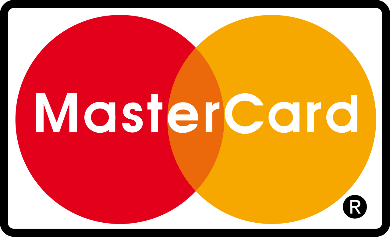
Mastercard converted its traditional, interlocking circles into a more modern-day and cohesive design.

Not only has Mastercard changed the look of the two inter-connected circles, but the brand also made a change that may not be noticeable to most people. Instead of the original MasterCard logo, the brand chose to drop the upper-case C and leave the name as Mastercard, giving it the appearance of one single term.
One reason for these shifts in the brand’s logo design is due to the company seeking to have a fresh start.
Asides from updating the brand’s logo design, Mastercard is planning on re-announcing its Masterpass service, which allows people to pay directly from their mobile device.
Mastercard’s rival, Visa, has recently made changes to its logo as well, but the changes took away from what made the logo stand out. The eye-catching, yellow, wordmark shifted into a dark blue one which blended in with the rest of the text, making the logo look more plain. The new modern logo design established by Mastercard gives the brand a competitive edge when it comes to its logo.
The changes made by both Mastercard and Masterpass will go into effect later this month.
The video below displays how the brand has revolutionized itself throughout the years.

